
Dimensionality.Multivariate data is often of huge size and high dimensionality that will most likely result a dense structure.It is hence difficult to present such data in a single visual display,making it challenging to enable users to explore the data space intuitively and interactively,as well as discriminating individual dimensions.Dual view and distortion skills like fisheyes may be helpful to solve this problem. Furthermore,the ordering of dimensions has a major impact on the expressiveness of visualization [7].Different arrangement allows different conclusions to be drawn, but no ordering principle is established so far. Design Tradeoffs.Visualization can provide a qualitative overview of large and complex datasets so that users can look for structure,features,patterns,trends and relationships more effectively [4].Due to the high dimensionality of multivariate data,we inevitably sacrifice the ability to show the details of each attributes [1]as we have fewer graphic attributes for encoding.This situation may not be flavored when quantitative analysis is required.For multivariate data visualization,there is always a tradeoff between amount of information,simplicity and accuracy. Assessment of Effectiveness.The ultimate goal of multivariate data visualization is to gain insight into the data and show the possible correlation between different attributes.In most cases certain correlations are not yet discovered prior to looking at the visual display,and they are exactly what we want to acquire after visualization. It is a paradox [5]that prohibits the assessment of effectiveness of an information visualization technique:We do not know what valuable knowledge is present in the data,so we hope to gain insight by visualizing it.Nevertheless,if we known nothing about the pattern or relationship to be shown in the data representation,we can never assess the effectiveness of a particular visualization technique. 2.Concepts and Terminology 2.1 Dimensionality Dimensionality of a problem in information visualization refers to the number of attributes,or more generally as variables,that presents in the data to be visualized [2].For one-dimensional data,which is also known as univariate data,consists of only one attributes,such as a collection of houses characterized by the cost.They can be visualized effectively by traditional tools like table and histogram.Interpretation of two-dimensional or bivariate data usually utilizes the x-y coordinates of a 2D space.A conventional approach is to plot one variable against the other called scatterplot,see Figure 2.1. 6
6 Dimensionality. Multivariate data is often of huge size and high dimensionality that will most likely result a dense structure. It is hence difficult to present such data in a single visual display, making it challenging to enable users to explore the data space intuitively and interactively, as well as discriminating individual dimensions. Dual view and distortion skills like fisheyes may be helpful to solve this problem. Furthermore, the ordering of dimensions has a major impact on the expressiveness of visualization [7]. Different arrangement allows different conclusions to be drawn, but no ordering principle is established so far. Design Tradeoffs. Visualization can provide a qualitative overview of large and complex datasets so that users can look for structure, features, patterns, trends and relationships more effectively [4]. Due to the high dimensionality of multivariate data, we inevitably sacrifice the ability to show the details of each attributes [1] as we have fewer graphic attributes for encoding. This situation may not be flavored when quantitative analysis is required. For multivariate data visualization, there is always a tradeoff between amount of information, simplicity and accuracy. Assessment of Effectiveness. The ultimate goal of multivariate data visualization is to gain insight into the data and show the possible correlation between different attributes. In most cases certain correlations are not yet discovered prior to looking at the visual display, and they are exactly what we want to acquire after visualization. It is a paradox [5] that prohibits the assessment of effectiveness of an information visualization technique: We do not know what valuable knowledge is present in the data, so we hope to gain insight by visualizing it. Nevertheless, if we known nothing about the pattern or relationship to be shown in the data representation, we can never assess the effectiveness of a particular visualization technique. 2. Concepts and Terminology 2.1 Dimensionality Dimensionality of a problem in information visualization refers to the number of attributes, or more generally as variables, that presents in the data to be visualized [2]. For one-dimensional data, which is also known as univariate data, consists of only one attributes, such as a collection of houses characterized by the cost. They can be visualized effectively by traditional tools like table and histogram. Interpretation of two-dimensional or bivariate data usually utilizes the x-y coordinates of a 2D space. A conventional approach is to plot one variable against the other called scatterplot, see Figure 2.1
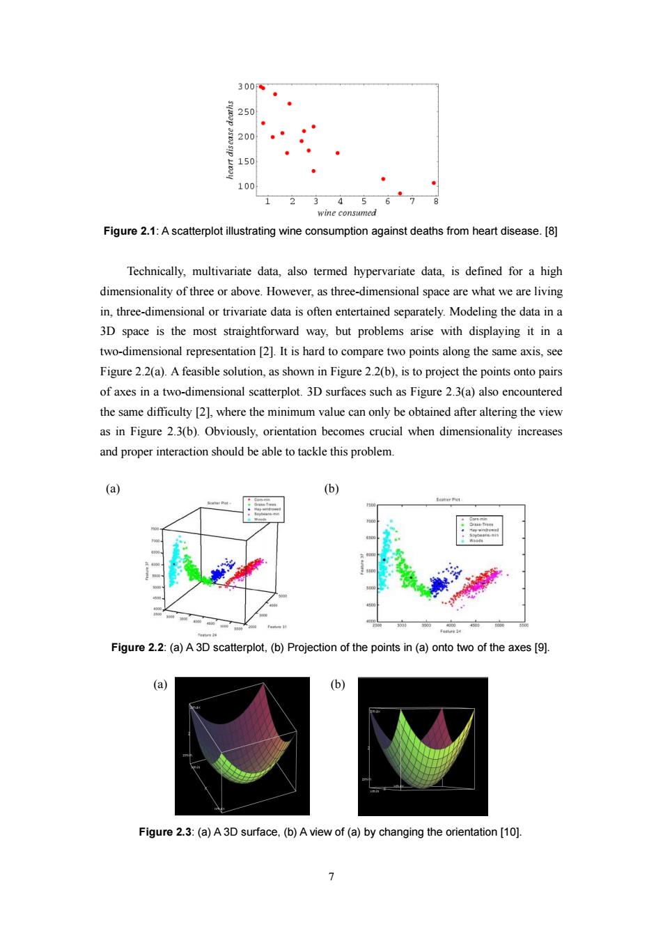
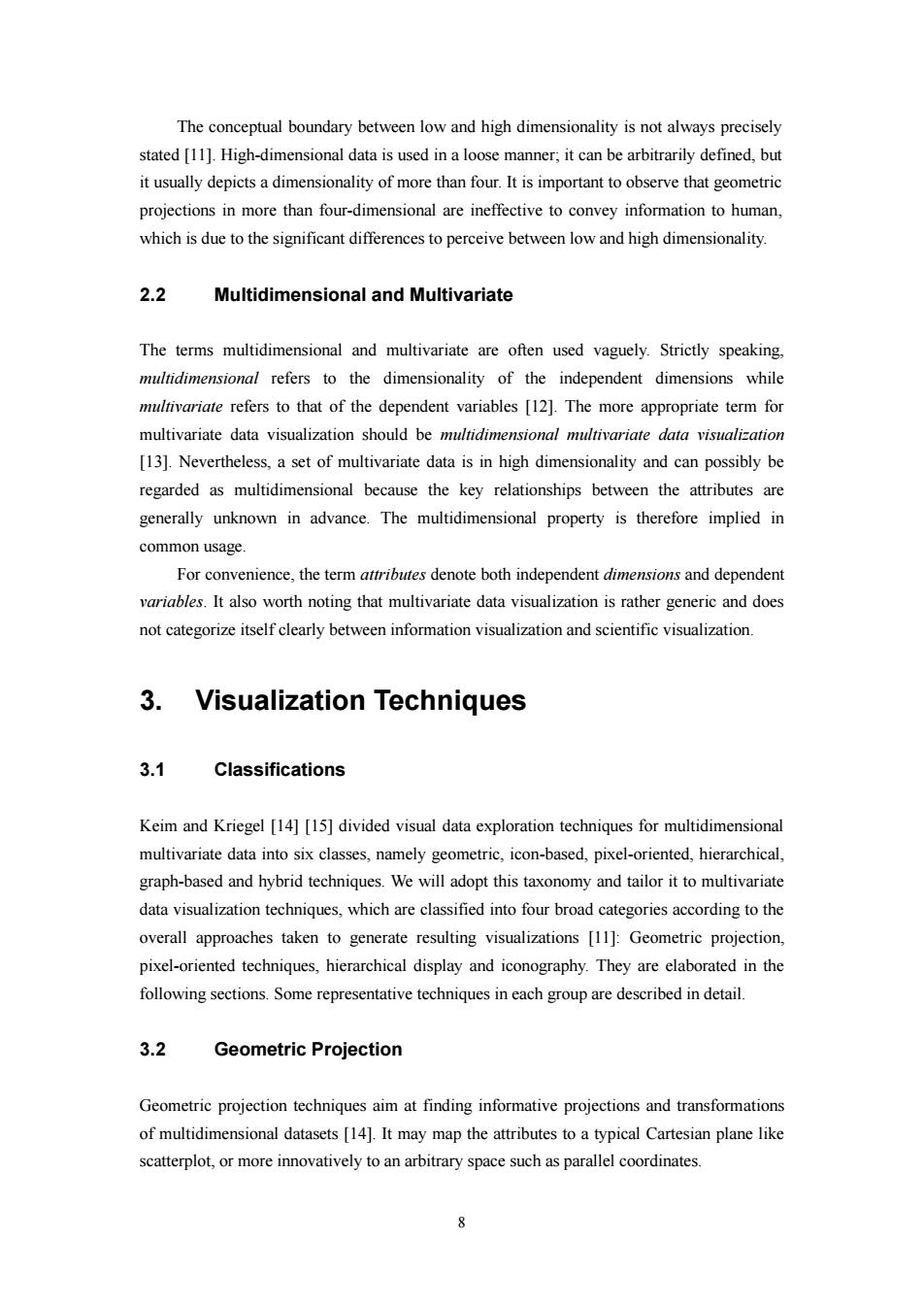
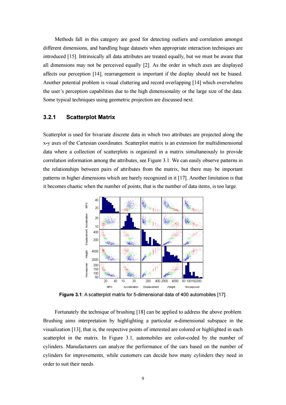
300 250 200 150 100 1 5 wine consumed Figure 2.1:A scatterplot illustrating wine consumption against deaths from heart disease.[8] Technically,multivariate data,also termed hypervariate data,is defined for a high dimensionality of three or above.However,as three-dimensional space are what we are living in,three-dimensional or trivariate data is often entertained separately.Modeling the data in a 3D space is the most straightforward way,but problems arise with displaying it in a two-dimensional representation [2].It is hard to compare two points along the same axis,see Figure 2.2(a).A feasible solution,as shown in Figure 2.2(b),is to project the points onto pairs of axes in a two-dimensional scatterplot.3D surfaces such as Figure 2.3(a)also encountered the same difficulty [2],where the minimum value can only be obtained after altering the view as in Figure 2.3(b).Obviously,orientation becomes crucial when dimensionality increases and proper interaction should be able to tackle this problem. (a) (b) 4 00 40 Figure 2.2:(a)A 3D scatterplot,(b)Projection of the points in (a)onto two of the axes [9]. (a) (b) Figure 2.3:(a)A3D surface,(b)A view of(a)by changing the orientation [10]
7 Figure 2.1: A scatterplot illustrating wine consumption against deaths from heart disease. [8] Technically, multivariate data, also termed hypervariate data, is defined for a high dimensionality of three or above. However, as three-dimensional space are what we are living in, three-dimensional or trivariate data is often entertained separately. Modeling the data in a 3D space is the most straightforward way, but problems arise with displaying it in a two-dimensional representation [2]. It is hard to compare two points along the same axis, see Figure 2.2(a). A feasible solution, as shown in Figure 2.2(b), is to project the points onto pairs of axes in a two-dimensional scatterplot. 3D surfaces such as Figure 2.3(a) also encountered the same difficulty [2], where the minimum value can only be obtained after altering the view as in Figure 2.3(b). Obviously, orientation becomes crucial when dimensionality increases and proper interaction should be able to tackle this problem. (a) (b) Figure 2.2: (a) A 3D scatterplot, (b) Projection of the points in (a) onto two of the axes [9]. (a) (b) Figure 2.3: (a) A 3D surface, (b) A view of (a) by changing the orientation [10]
The conceptual boundary between low and high dimensionality is not always precisely stated [11].High-dimensional data is used in a loose manner;it can be arbitrarily defined,but it usually depicts a dimensionality of more than four.It is important to observe that geometric projections in more than four-dimensional are ineffective to convey information to human, which is due to the significant differences to perceive between low and high dimensionality. 2.2 Multidimensional and Multivariate The terms multidimensional and multivariate are often used vaguely.Strictly speaking, multidimensional refers to the dimensionality of the independent dimensions while multivariate refers to that of the dependent variables [12].The more appropriate term for multivariate data visualization should be multidimensional multivariate data visualization [13].Nevertheless,a set of multivariate data is in high dimensionality and can possibly be regarded as multidimensional because the key relationships between the attributes are generally unknown in advance.The multidimensional property is therefore implied in common usage For convenience,the term attributes denote both independent dimensions and dependent variables.It also worth noting that multivariate data visualization is rather generic and does not categorize itself clearly between information visualization and scientific visualization. 3.Visualization Techniques 3.1 Classifications Keim and Kriegel [14][15]divided visual data exploration techniques for multidimensional multivariate data into six classes,namely geometric,icon-based,pixel-oriented,hierarchical, graph-based and hybrid techniques.We will adopt this taxonomy and tailor it to multivariate data visualization techniques,which are classified into four broad categories according to the overall approaches taken to generate resulting visualizations [11]:Geometric projection, pixel-oriented techniques,hierarchical display and iconography.They are elaborated in the following sections.Some representative techniques in each group are described in detail. 3.2 Geometric Projection Geometric projection techniques aim at finding informative projections and transformations of multidimensional datasets [14].It may map the attributes to a typical Cartesian plane like scatterplot,or more innovatively to an arbitrary space such as parallel coordinates
8 The conceptual boundary between low and high dimensionality is not always precisely stated [11]. High-dimensional data is used in a loose manner; it can be arbitrarily defined, but it usually depicts a dimensionality of more than four. It is important to observe that geometric projections in more than four-dimensional are ineffective to convey information to human, which is due to the significant differences to perceive between low and high dimensionality. 2.2 Multidimensional and Multivariate The terms multidimensional and multivariate are often used vaguely. Strictly speaking, multidimensional refers to the dimensionality of the independent dimensions while multivariate refers to that of the dependent variables [12]. The more appropriate term for multivariate data visualization should be multidimensional multivariate data visualization [13]. Nevertheless, a set of multivariate data is in high dimensionality and can possibly be regarded as multidimensional because the key relationships between the attributes are generally unknown in advance. The multidimensional property is therefore implied in common usage. For convenience, the term attributes denote both independent dimensions and dependent variables. It also worth noting that multivariate data visualization is rather generic and does not categorize itself clearly between information visualization and scientific visualization. 3. Visualization Techniques 3.1 Classifications Keim and Kriegel [14] [15] divided visual data exploration techniques for multidimensional multivariate data into six classes, namely geometric, icon-based, pixel-oriented, hierarchical, graph-based and hybrid techniques. We will adopt this taxonomy and tailor it to multivariate data visualization techniques, which are classified into four broad categories according to the overall approaches taken to generate resulting visualizations [11]: Geometric projection, pixel-oriented techniques, hierarchical display and iconography. They are elaborated in the following sections. Some representative techniques in each group are described in detail. 3.2 Geometric Projection Geometric projection techniques aim at finding informative projections and transformations of multidimensional datasets [14]. It may map the attributes to a typical Cartesian plane like scatterplot, or more innovatively to an arbitrary space such as parallel coordinates
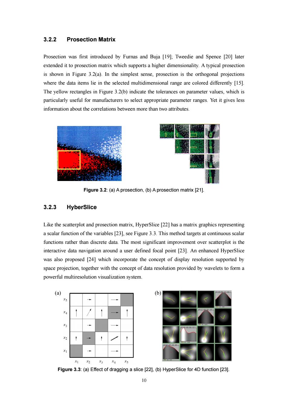
Methods fall in this category are good for detecting outliers and correlation amongst different dimensions,and handling huge datasets when appropriate interaction techniques are introduced [15].Intrinsically all data attributes are treated equally,but we must be aware that all dimensions may not be perceived equally [2].As the order in which axes are displayed affects our perception [14],rearrangement is important if the display should not be biased. Another potential problem is visual cluttering and record overlapping [14]which overwhelms the user's perception capabilities due to the high dimensionality or the large size of the data. Some typical techniques using geometric projection are discussed next. 3.2.1 Scatterplot Matrix Scatterplot is used for bivariate discrete data in which two attributes are projected along the x-y axes of the Cartesian coordinates.Scatterplot matrix is an extension for multidimensional data where a collection of scatterplots is organized in a matrix simultaneously to provide correlation information among the attributes,see Figure 3.1.We can easily observe patterns in the relationships between pairs of attributes from the matrix,but there may be important patterns in higher dimensions which are barely recognized in it [17].Another limitation is that it becomes chaotic when the number of points,that is the number of data items,is too large 20 10 400 200 4000 2000 1 50 5 20 40 10 20 20040020004000 50100150200 NPG Acceleration Displacement Weight Horsepower Figure 3.1:A scatterplot matrix for 5-dimensional data of 400 automobiles [17]. Fortunately the technique of brushing [18]can be applied to address the above problem. Brushing aims interpretation by highlighting a particular n-dimensional subspace in the visualization [13],that is,the respective points of interested are colored or highlighted in each scatterplot in the matrix.In Figure 3.1,automobiles are color-coded by the number of cylinders.Manufacturers can analyze the performance of the cars based on the number of cylinders for improvements,while customers can decide how many cylinders they need in order to suit their needs. 9
9 Methods fall in this category are good for detecting outliers and correlation amongst different dimensions, and handling huge datasets when appropriate interaction techniques are introduced [15]. Intrinsically all data attributes are treated equally, but we must be aware that all dimensions may not be perceived equally [2]. As the order in which axes are displayed affects our perception [14], rearrangement is important if the display should not be biased. Another potential problem is visual cluttering and record overlapping [14] which overwhelms the user’s perception capabilities due to the high dimensionality or the large size of the data. Some typical techniques using geometric projection are discussed next. 3.2.1 Scatterplot Matrix Scatterplot is used for bivariate discrete data in which two attributes are projected along the x-y axes of the Cartesian coordinates. Scatterplot matrix is an extension for multidimensional data where a collection of scatterplots is organized in a matrix simultaneously to provide correlation information among the attributes, see Figure 3.1. We can easily observe patterns in the relationships between pairs of attributes from the matrix, but there may be important patterns in higher dimensions which are barely recognized in it [17]. Another limitation is that it becomes chaotic when the number of points, that is the number of data items, is too large. Figure 3.1: A scatterplot matrix for 5-dimensional data of 400 automobiles [17]. Fortunately the technique of brushing [18] can be applied to address the above problem. Brushing aims interpretation by highlighting a particular n-dimensional subspace in the visualization [13], that is, the respective points of interested are colored or highlighted in each scatterplot in the matrix. In Figure 3.1, automobiles are color-coded by the number of cylinders. Manufacturers can analyze the performance of the cars based on the number of cylinders for improvements, while customers can decide how many cylinders they need in order to suit their needs
3.2.2 Prosection Matrix Prosection was first introduced by Furnas and Buja [19];Tweedie and Spence [20]later extended it to prosection matrix which supports a higher dimensionality.A typical prosection is shown in Figure 3.2(a).In the simplest sense,prosection is the orthogonal projections where the data items lie in the selected multidimensional range are colored differently [15]. The yellow rectangles in Figure 3.2(b)indicate the tolerances on parameter values,which is particularly useful for manufacturers to select appropriate parameter ranges.Yet it gives less information about the correlations between more than two attributes. Figure 3.2:(a)A prosection,(b)A prosection matrix [21]. 3.2.3 HyberSlice Like the scatterplot and prosection matrix,HyperSlice [22]has a matrix graphics representing a scalar function of the variables [23],see Figure 3.3.This method targets at continuous scalar functions rather than discrete data.The most significant improvement over scatterplot is the interactive data navigation around a user defined focal point [23].An enhanced HyperSlice was also proposed [24]which incorporate the concept of display resolution supported by space projection,together with the concept of data resolution provided by wavelets to form a powerful multiresolution visualization system. (a) b a 3 1 Figure 3.3:(a)Effect of dragging a slice [22].(b)HyperSlice for 4D function [23]. 0
10 3.2.2 Prosection Matrix Prosection was first introduced by Furnas and Buja [19]; Tweedie and Spence [20] later extended it to prosection matrix which supports a higher dimensionality. A typical prosection is shown in Figure 3.2(a). In the simplest sense, prosection is the orthogonal projections where the data items lie in the selected multidimensional range are colored differently [15]. The yellow rectangles in Figure 3.2(b) indicate the tolerances on parameter values, which is particularly useful for manufacturers to select appropriate parameter ranges. Yet it gives less information about the correlations between more than two attributes. Figure 3.2: (a) A prosection, (b) A prosection matrix [21]. 3.2.3 HyberSlice Like the scatterplot and prosection matrix, HyperSlice [22] has a matrix graphics representing a scalar function of the variables [23], see Figure 3.3. This method targets at continuous scalar functions rather than discrete data. The most significant improvement over scatterplot is the interactive data navigation around a user defined focal point [23]. An enhanced HyperSlice was also proposed [24] which incorporate the concept of display resolution supported by space projection, together with the concept of data resolution provided by wavelets to form a powerful multiresolution visualization system. (a) (b) Figure 3.3: (a) Effect of dragging a slice [22], (b) HyperSlice for 4D function [23]